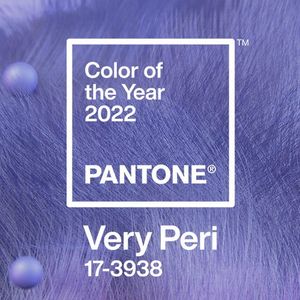
Periwinkle is a trailing plant used as groundcover and featuring blooms in lavender-blue. Periwinkle is also the name of Tinkerbell’s sister in Disney lore. And now, periwinkle is the inspiration for Pantone’s 2022 Color of the Year.
PANTONE 17-3938 Very Peri is a striking periwinkle blue hue with a “vivifying violet red undertone” that creates an “empowering mix of newness,” said Pantone. In fact, the 2022 choice breaks the Color of the Year mold in this regard; instead of drawing from Pantone’s extensive color catalog, the company came up with something entirely new for 2022.
“Creating a new color for the first time in the history of our Pantone Color of the Year educational color program reflects the global innovation and transformation taking place,” said Laurie Pressman, Vice President of the Pantone Color Institute, in a news release announcing the color. “As society continues to recognize color as a critical form of communication, and a way to express and affect ideas and emotions and engage and connect, the complexity of this new red violet infused blue hue highlights the expansive possibilities that lay before us.”
As the company has done for several years—Last year’s dual choices, Ultimate Gray and Illuminating, evoked “deeper feelings of thoughtfulness and optimism,” while 2020’s Classic Blue represented strength and reassurance—2022’s color choice reflects the state of the world.
“Very Peri is a symbol of the global zeitgeist of the moment and the transition we are going through,” said Pantone. “As we emerge from an intense period of isolation, our notions and standards are changing, and our physical and digital lives have merged in new ways. With trends in gaming, the expanding popularity of the metaverse and rising artistic community in the digital space PANTONE® 17-3938 Very Peri illustrates the fusion of modern life and how color trends in the digital world are being manifested in the physical world and vice versa.”
But how does that translate to design? Very Peri likely lends itself best to accessories and accents, where its “carefree confidence and daring curiosity” can thrive. The company asserts that the color is “evocative of new modernity and “injects a sense of playful freshness into home interiors, and…we agree.
How about a Murano Periwinkle Glass Round Midcentury Chandelier from 1st Dibs? A set of richly hued sheets from Tekla? Or a Persian rug that pairs its dreamy hue with muted gray. These are just a few ways to incorporate Very Peri into your home without overwhelming it with pastel purple.
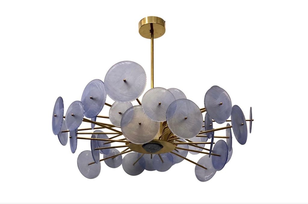
Murano Periwinkle Glass Round Midcentury Chandelier, 1980, | $6,670

Lavender is definitely having a moment, so the options are ever-increasing. Consumer and design trend authority, WGSN, and Coloro, a global color expert, expect Digital Lavender to be at the forefront of design in 2023 and 2024. “With a holistic overview into wellness, designing for emotion will be key, as consumers will need to feel supported while building their vision of the future,” said Joanne Thomas, Head of Content at Coloro.
Want to immerse yourself in the Very Peri experience before bringing it home? Pantone will bring an immersive color installation to a 100-year-old boiler room beneath the Chelsea Market in New York in 2022. This ongoing collaboration with Pantone will “produce a visually and audibly compelling immersive digital experience incorporating rich textures and images of the Color to celebrate the unveiling in an innovative way for the 21st century audience,” they said.